Executive Summary
Led the comprehensive redesign of NYC Department of Education’s legacy systems, creating a unified cross-platform design system and over 100 screen templates to replace outdated COBOL-based interfaces. The project delivered a consistent user experience across iOS, Android, and web applications while reducing $40MM+ annual maintenance costs and significantly improving workflows for thousands of education professionals across NYC’s public school system.
“This project wasn’t just about redesigning interfaces—it was about transforming how 1.1 million students are supported by giving educators modern tools that work across all devices.”
Key Metrics
- $40M+ annual maintenance costs targeted for reduction
- 100+ screen templates designed for critical workflows
- 30+ stakeholder interviews conducted
- 200+ users surveyed during research
- 6 UX designers led under my direction
- 3 platforms unified (iOS, Android, Web)
The Challenge
Context
The NYC Department of Education (DOE) faced a critical infrastructure challenge with their core administrative systems:
- Outdated Technology: 1980s COBOL-based systems with minimal updates
- Unsustainable Costs: $40M+ annual maintenance and increasing
- Operational Friction: Command-line interfaces requiring extensive training
- Limited Accessibility: No mobile capabilities for school-based staff
“Teachers were spending precious classroom time on attendance tasks that required laptops, complex logins, and cumbersome navigation—when they should have been focusing on students.”
My Role and Team Structure
As Lead UX Designer, I directed a multidisciplinary team focused on creating a cohesive cross-platform experience:
- Strategic Leadership: Managing 6 UX professionals and guiding design direction
- Stakeholder Management: Building relationships with key DOE departments
- Cross-Platform Design System Architecture: Creating a unified framework that worked seamlessly across iOS, Android and web
- Cross-Functional Collaboration: Working closely with DOE Project Manager, research team, and development partners
Discovery and Research
Key Insights
Our comprehensive research revealed:
- Legacy Dependency: Long-term staff had developed complex workarounds and memorized command codes
- Varying Technical Proficiency: Staff ranged from tech-savvy to those struggling with basic computer operations
- Mobile Needs: School-based staff needed access to systems from anywhere in the classroom
“Many administrators told us, ‘I know this system is difficult, but I’ve memorized all the codes and shortcuts—don’t make me relearn everything.'”


Strategic Approach
Based on our research findings, we developed a three-pronged strategic approach:
1. Start With a Focused Proof of Concept
We identified attendance-taking as our first target application:
- High-friction daily task for teachers
- Immediate tangible benefits through mobile solution
- Foundation for broader acceptance
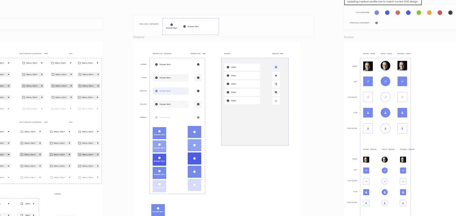
2. Develop a Cross-Platform Design System
Our comprehensive design system:
- Built consistent experiences across iOS, Android, and web applications
- Allowed users to switch between platforms without relearning interfaces
- Leveraged the Telerik Kendo component library for implementation efficiency
3. Apply Key Design Principles
Throughout the project, we adhered to three guiding principles:
- “Start with the end goal in mind”: Design for the ideal future state
- “Just in time, not just in case”: Make decisions based on current data
- “80/20 rule”: Focus on use cases covering the majority of scenarios
The Design Process
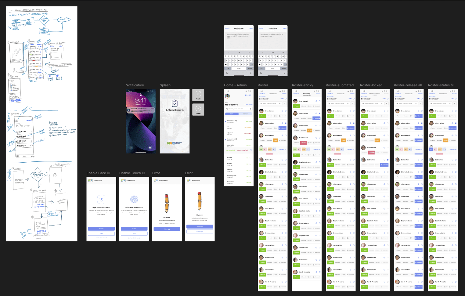
Attendance App: The Initial Proof of Concept
We began with a mobile attendance app featuring:
- Biometric authentication for quick access
- Class rosters with student photos
- Simple attendance marking interactions
- Real-time synchronization
“When we showed teachers they could take attendance with just a few taps on their phone instead of logging into a desktop computer, their eyes lit up. One principal said, ‘When can we have this yesterday?'”
Cross-Platform Design System
Our design system included:
- Platform-Adaptive Visual Style: Consistent yet native-feeling across devices
- Component Library: From buttons to complex data tables
- Interaction Patterns: Standardized behaviors respecting platform conventions
- Accessibility Standards: Education-specific compliance requirements

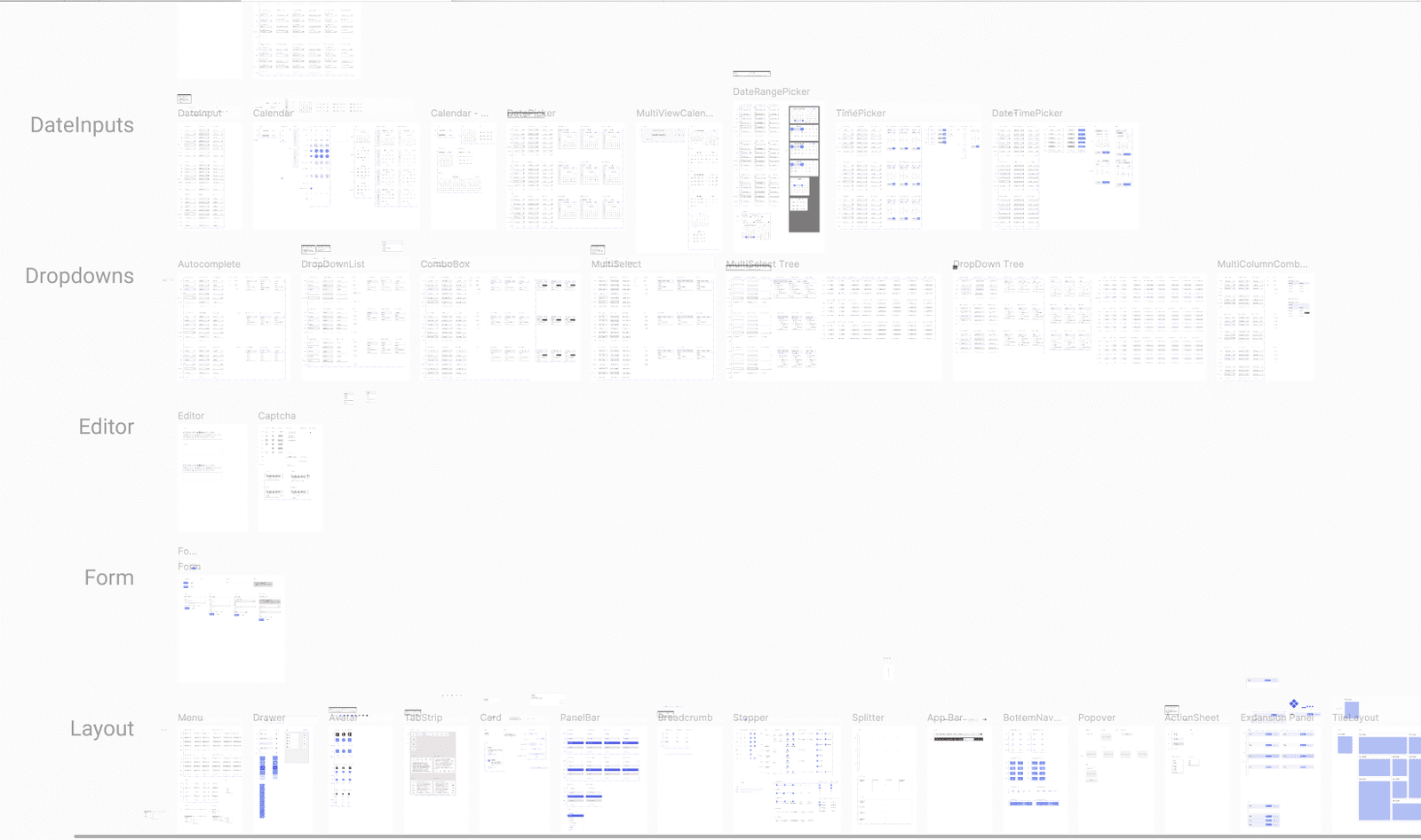

Screen Template Development
We created 100+ screen templates covering critical workflows across platforms:
- Student information management
- Attendance tracking
- Academic records
- Staff management
- Reporting
- Administrative functions


Results and Impact
User Experience Transformation
- Modernized Interfaces: Intuitive graphical elements replaced command-line inputs
- Cross-Platform Accessibility: Seamless experience across iOS, Android, and web
- Platform Fluidity: Consistent experience allowing easy device switching
“Principals were proactively asking ‘When will we have this?’ after seeing just the initial prototypes. The enthusiasm across all levels of the organization was overwhelming.”
Business Impact
- Cost Reduction: Foundation for phasing out expensive legacy systems
- Training Efficiency: More intuitive interfaces requiring less extensive training
- Operational Agility: Faster updates and new feature development
Challenges and Solutions
Balancing Innovation vs. Familiarity
Challenge: Modernizing the experience without alienating long-term users.
Solution: Incorporated familiar terminology and codes alongside modern UI elements, creating a hybrid approach that supported both novice and experienced users.
Managing Scale and Complexity
Challenge: Hundreds of functions across dozens of departments made redesign overwhelming.
Solution: Phased approach starting with mobile attendance app established credibility before tackling more complex functions.
“By starting with a focused mobile app that solved a real pain point, we built trust that carried us through the more complex challenges of the entire system redesign.”
Key Learnings
- Start Small, Think Big: Beginning with a focused proof of concept demonstrated value quickly while establishing foundation for extensive changes.
- Cross-Platform Consistency Matters: Investing in a comprehensive design system that worked across all platforms dramatically accelerated our ability to create consistent, high-quality experiences.
- Balance Ideal and Real: While designing for the ideal future state, we remained pragmatic about implementation realities.
Conclusion
The NYC Department of Education Design System project established the foundation for modernizing systems that serve over 1.1 million students and thousands of education professionals across multiple platforms and devices.
By focusing first on understanding user needs, then creating a scalable cross-platform design framework, and finally developing specific solutions, we created a path forward for one of the nation’s largest educational institutions to provide better tools for educators regardless of which device they use.
“This project transformed how the DOE approaches technology—from maintaining legacy systems to creating user-centered experiences that work for everyone, everywhere.”