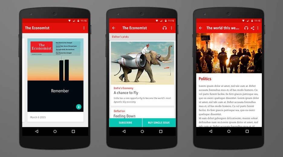
The release of Google’s material design made the app look really dated. It also made some of the interaction patterns and visual elements used in the app inconsistent with the rest of the Android universe.
In addition to the challenge of applying the new language onto our app, there were few internal challenges that could derail this project such as lack of common discovery process, newly formed team and stakeholder management.
Result
4.3 stars on Google Play Story. A jump from 3.5 stars before the redesign.
Role
As the Lead UX, I was responsible for managing a team of UX and visual designers, with some hands-on involvement in interaction design, information architecture and Prototyping when necessary.
Process
The first problem that we had to tackle was defining the scope of the project. There were discussions about redefining some of the interactions and user flows, introduction of new features and new ad format. In other words, the scope of this project was expanding rapidly. Working closely with the Product Owner, UX helped set the success criteria for this project, which is a pure reskin as the must have’s and usability improvements as nice-to-have’s.

Up to the point when we started this project, we had no formal UX process. All UX needs were raised by developers during implementation phase then the UX resource would create deliverables to unblock the developers.
The first thing we did as a team was to agreed on being proactive in defining the stories. This was a great project to push this initiative because the bulk of the work requires UX.
We set up a trello kanban board to visualize all stories that need to be done, collaborate and communicate progress to stakeholders.

We also started daily design stand-up calls with weekly sync up with bigger group of stakeholders. This was particularly important because our team is distributed across 3 continents: US, UK and India.
After we finished the discovery phase and move on to implementation, the UX/design team combined our daily stand-up calls with the tech team. We did this until the end of the project.

Since the UX/design resources were distributed across different locations, we needed a way to maintain consistency in the UI elements. To do this, we created a UI kit so we could minimize the variations between common UI elements.
As part of the hand over between the designers and developers, we standardized our visual design specs and used video demos so the developer can easily see and experience what the final product would feel like. We used keynote to produced the video demos since it’s the tool the design team is familiar with, so they could focus on the motion design without having to learn how to code.
