Very high bounce rate for our website caused by mobile users trying to use our web site that was designed for desktop. We created a new theme to quickly address this issue.
Result
Within a year after launch, we significantly dropped the bounce rate and started generating subscription revenue from the mobile traffic. This proved to be crucial as users who come from social network are mainly on mobile device.
Role
Lead UX working with a UX architect and visual designer.
Credits
- Visual design: Russ Street
- UX + User Research: Sara Stangalini
Process
1. Understand
We started the project by doing few types of research. Competitive analysis where we looked at direct and indirect competitors as well as industry trend and best practices for mobile user experience. In parallel, we looked at analytics data to understand our users better and answer questions that could influence the direction of the project (i.e. screen resolutions, device capabilities, mobile vs desktop traffic, etc.).
We realized that we were missing a lot of the necessary information to move forward in exploring possible solutions. In order to get the information in the most expedient way, we decided to conduct a 2 day design studio workshop with key stakeholders.
2. Design studio workshop

After we did the competitive research to get an idea of best practices, we decided to do a design studio workshop to jump start the project.
We decided to do this because there were many stakeholders in NYC and London involved, so doing the traditional steps of circulating wireframes would take up too much time.
We ran the workshop in both offices simultaneously with video conference.
We ran it for 2 full days and for both days we had representative from editorial, business, UX and dev on both sides.
On the NY side, our scrum master and I led the workshop, while in London, my UX counterpart and her intern led the workshop.
At the end of the workshop, we had sketches that show the solutions for various problems that stakeholders already agreed on.

3. Consolidate ideas
Based on the sketches produced at the workshop, we created more detailed sketches to make sure that the solutions we came up with during the workshop would work (avoid conflicts, consider use cases, see data from analytics, etc.)
4. Wireframes
After the sketches, we moved forward with wireframing the solutions which guides the visual design and prototyping stages as well as making sure all stakeholders are on the same page.
One of the main things, that we would like to do in this project is to incorporate infinite scroll as a more “sticky” way for content discovery.
Since we’re working in agile and pieces were still moving around in terms of timeframe and resources, we had to come up with a back up solution in case we had to launch without infinite scroll for various parts of the site.
5. Visual design
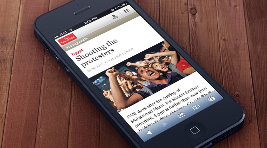
Attached is one of the screens that we designed using the style established by the visual designer.
In this particular home page mock up, I included annotation and content structure to help visualize the content set included in the design.
6. Prototype
To play around with the prototype yourself, open the following link on your mobile browser
http://bit.ly/ec_mob_proto
To get a better idea of how some of the interactions would work, I prototyped few screens based on the key user journeys.
These prototypes were also used in usability study (see below). The link above points to the latest version of the prototype, built for iOS (iphone/ipod) since I have an iphone available for development and we used an ipod touch for the usability test
7. Usability study
To make sure we don’t have any big usability issue for the main user journeys (i.e. reading articles, paywall, etc.), we ran a usability study with 8 participants.
My colleague, Sara Stangalini, in the UK facilitated the study, recorded the sessions then shared the video recordings with the team. Here’s one the recordings from the sessions:
8. Implementation
Fortunately, we didn’t see any major usability issue during the sessions, so we made some minor adjustments based on the findings of the study and went ahead with implementation.
Artifacts and Deliverables


