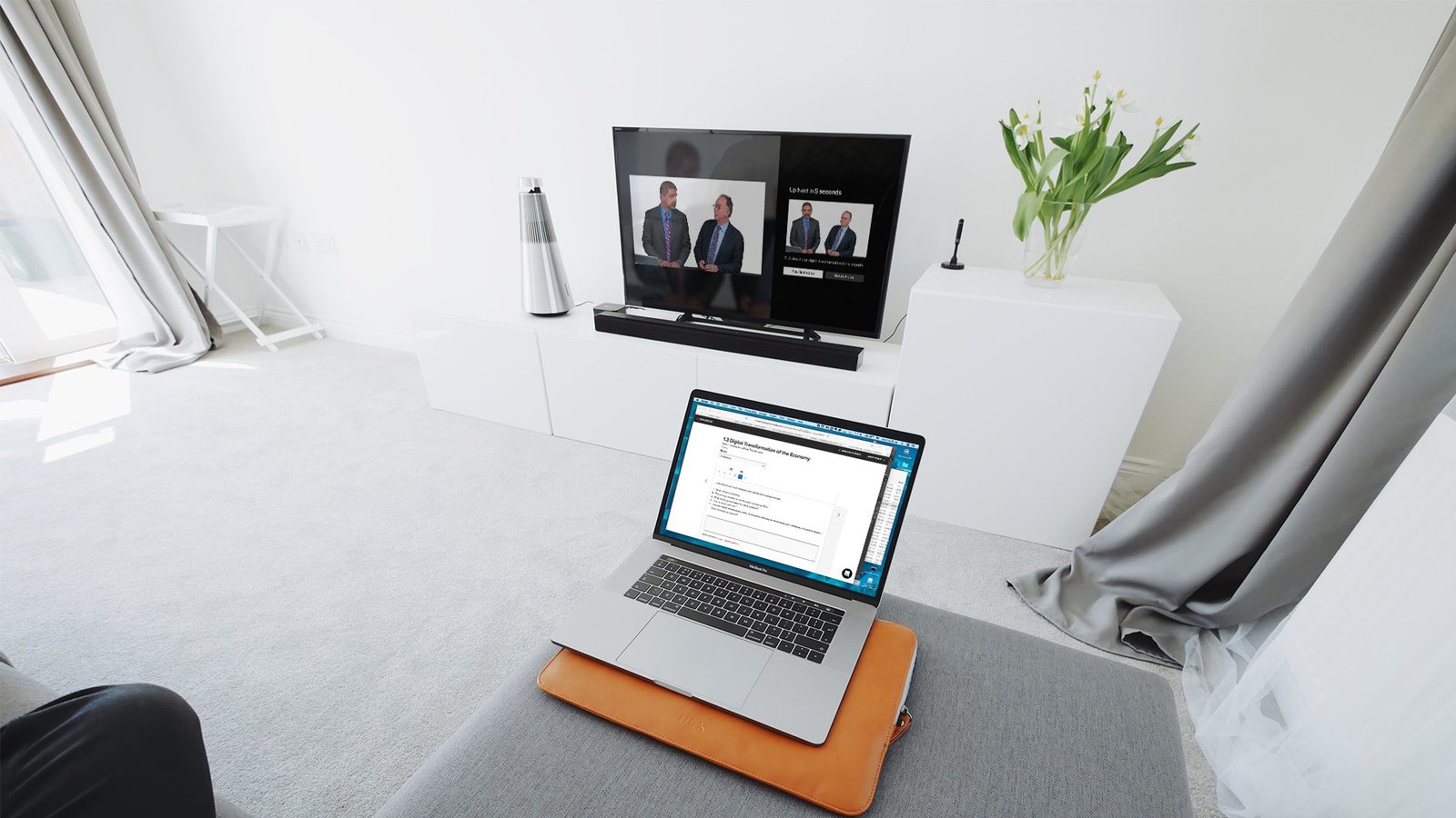
Given the rise in popularity of Apple TV, 2U decided to create an Apple TV app. A good amount of content in the course work are presented in video format, therefore being able to use their big screen TV while working on their course work was one of the features that was requested frequently. Before we created this app, the experience was a crude mirroring of the user’s mobile screen on the big screen.
Objective
Increase students’ engagement, allowing them to take advantage of their big screen TV to complete course work.
Role
Lead UX, visual designer
Process
Research: Quantitative Data
We started with high level analysis of the users behavioral data in Apple’s App analytics and Google Analytics. We reviewed students’ activity on the web LMS and mobile app. One of the things we learned was that students typically block a chunk of time (few hours) to do their course work. Within this period, they would try to complete as much work as possible similar to the binging behavior on Streaming TV.
Research: Qualitative Data
To validate the quantitative data that we saw in the analytics, we interviewed a customer service representative, 2 product managers and 6 students.
We learned more information that gave us a clearer picture of what the students experience and validated what we saw in the quantitative data.
Research: Subject Matter Expert Interviews
Since this app would be one of the ways to access the course work in addition to the existing products (web-based platform, native iOS and Android apps), we had to make sure that the students could seamlessly switch back-and-forth between the various devices.
To get a good grasp of the constraints, content structure and other requirements, we interviewed product managers, business analyst, customer service representative and UX designers for the web and mobile products.
Research: Comparative Analysis
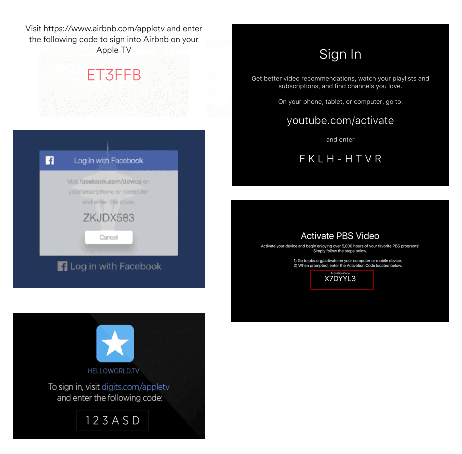
As we started to design for this form factor, we needed to get familiar with the interaction patterns used in this medium.
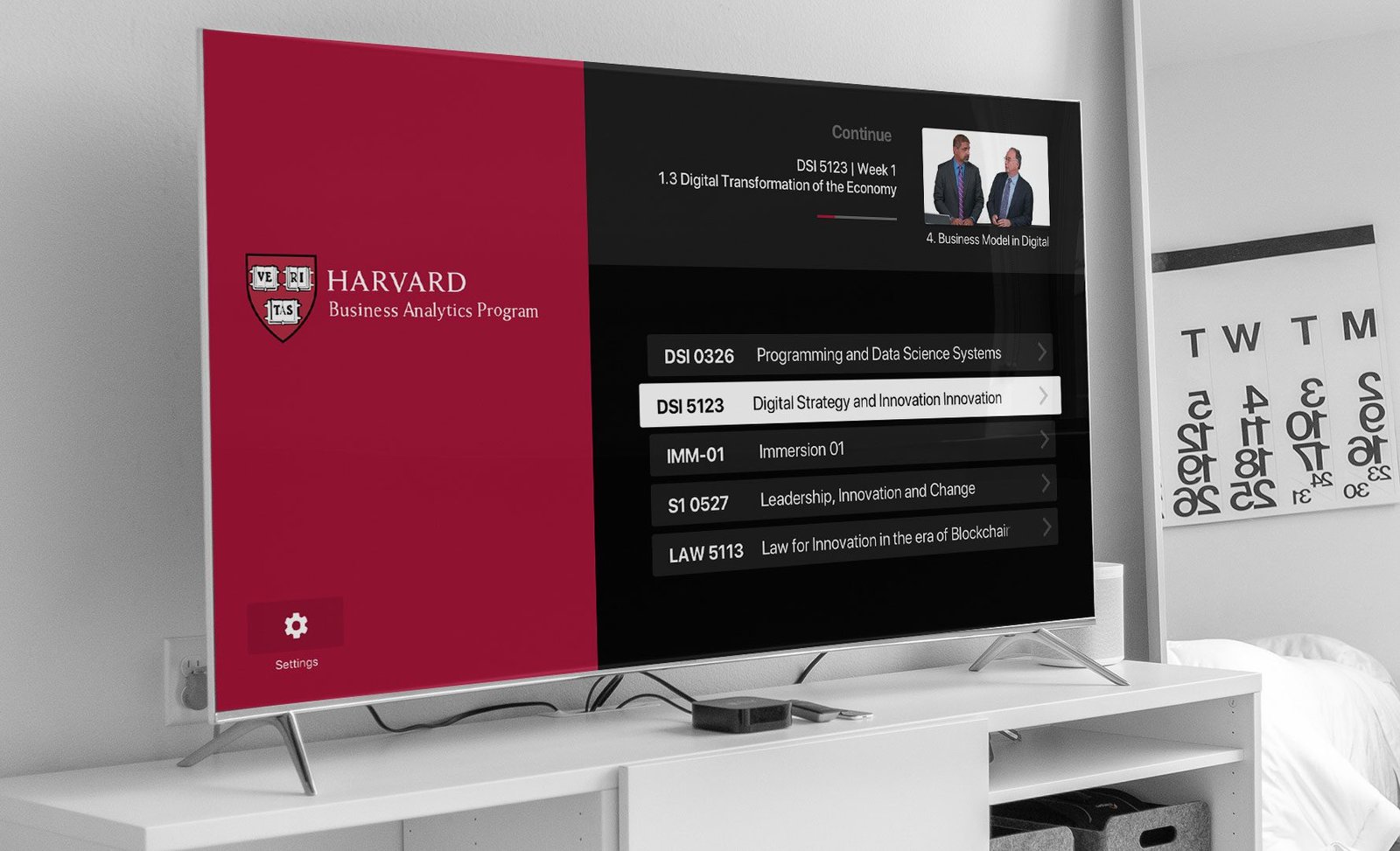
What we discovered from the quantitative and qualitative data was that the way the students consume content within their course work is very similar to how the viewers of streaming video apps (i.e. Netflix, Amazon Prime Video, Hulu) binge a TV series. Similar to the way TV series have their episodes in order, the courses have modules and topics that need to be consumed in a linear order.
This led us to study the way those streaming video apps work and how they make it easy for their viewers to do various tasks like device activation, navigating to the next episode, etc.
Design and Usability Testing Round I
We started with focusing on presenting all available content in the way that fits the medium and how users interact with the form factor (TV).
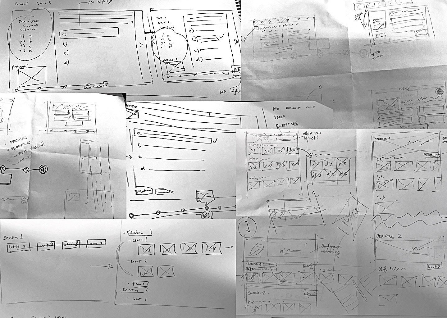
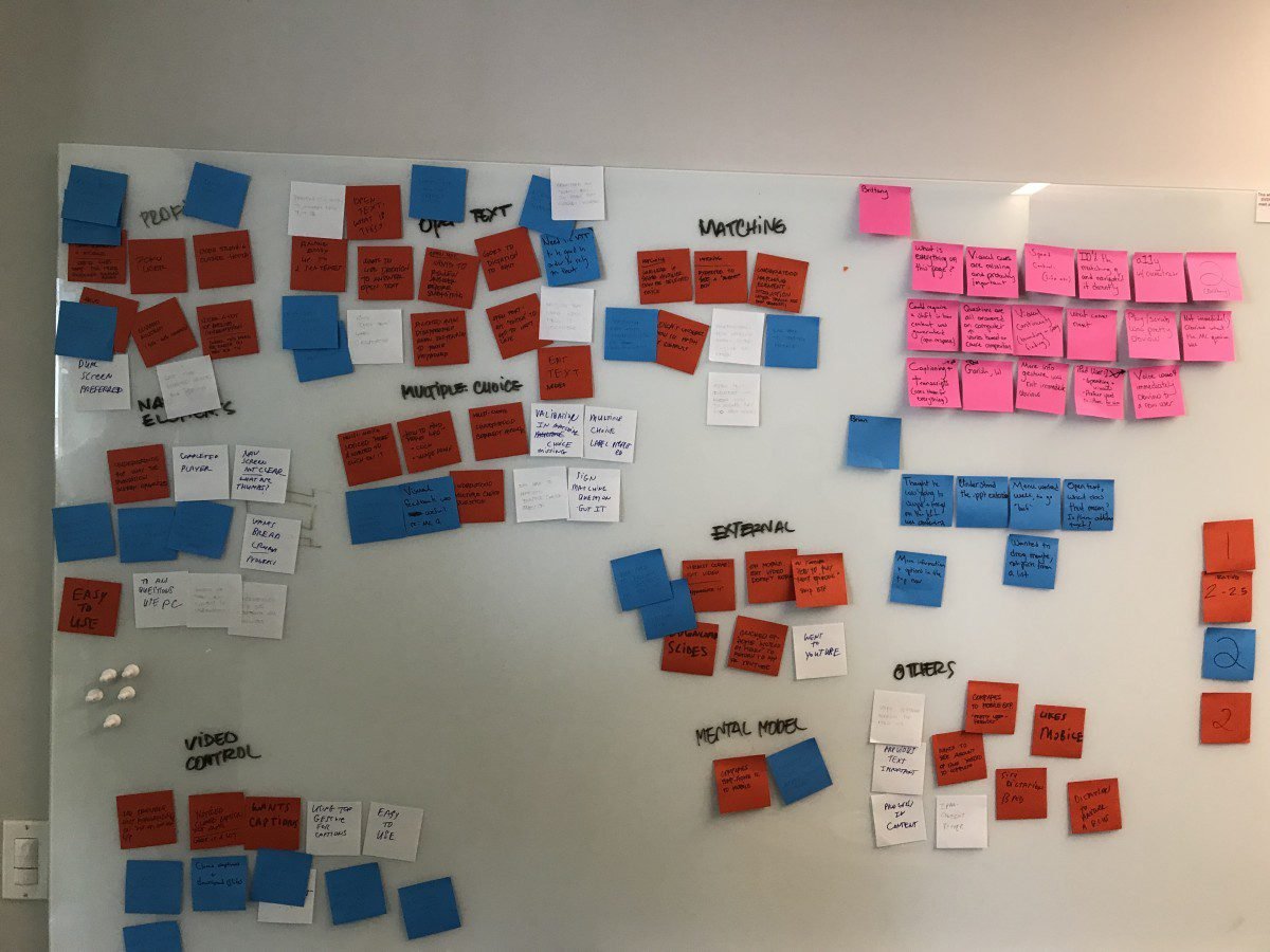
We did few workshops to get the core team (product manager, UX, business analyst and tech lead) to ideate by sketching the various screens. From there, we went straight to high fidelity mockups that got implemented in the prototype. We’re lucky to have our tech lead available to create prototype in real code that could be deployed on Apple TV for our usability testing.
For the first round of testing, we planned to test with 5 participants, but after the 3rd participants, we decided that we already saw clear patterns for usability issues that we needed to fix, so we canceled the remaining sessions.
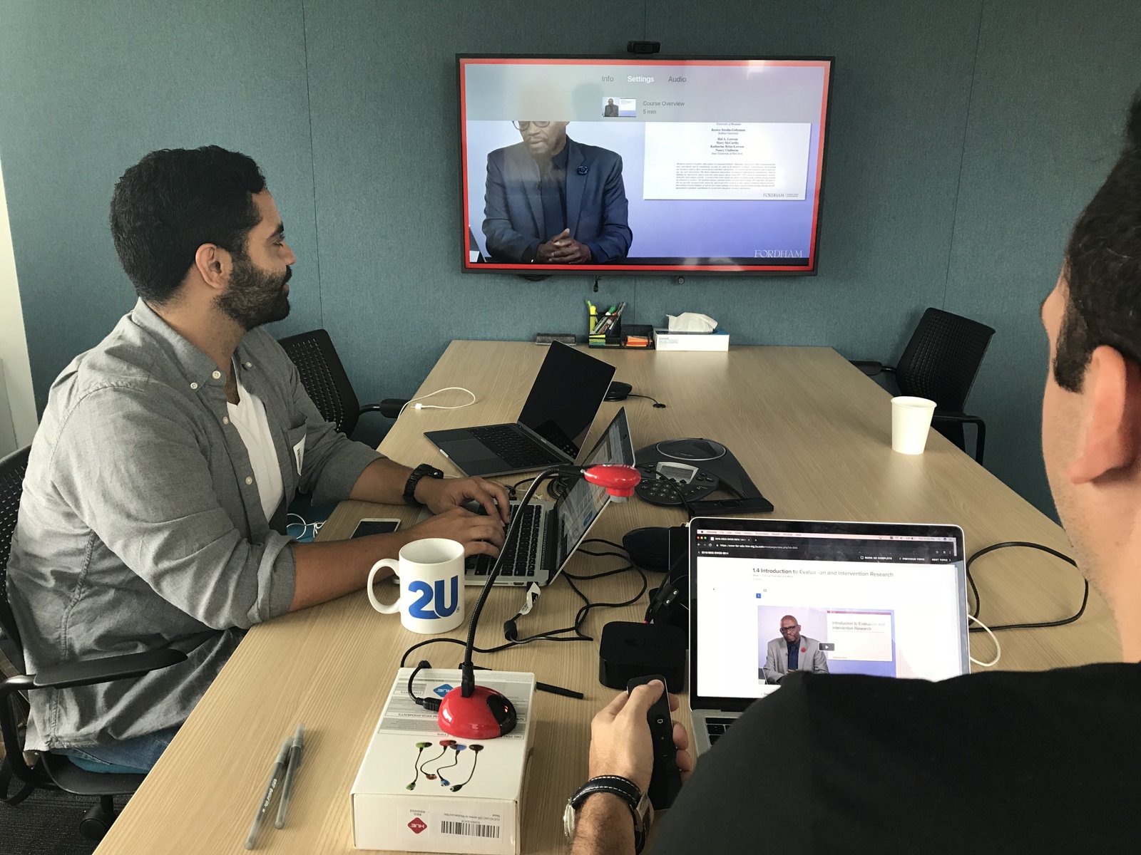
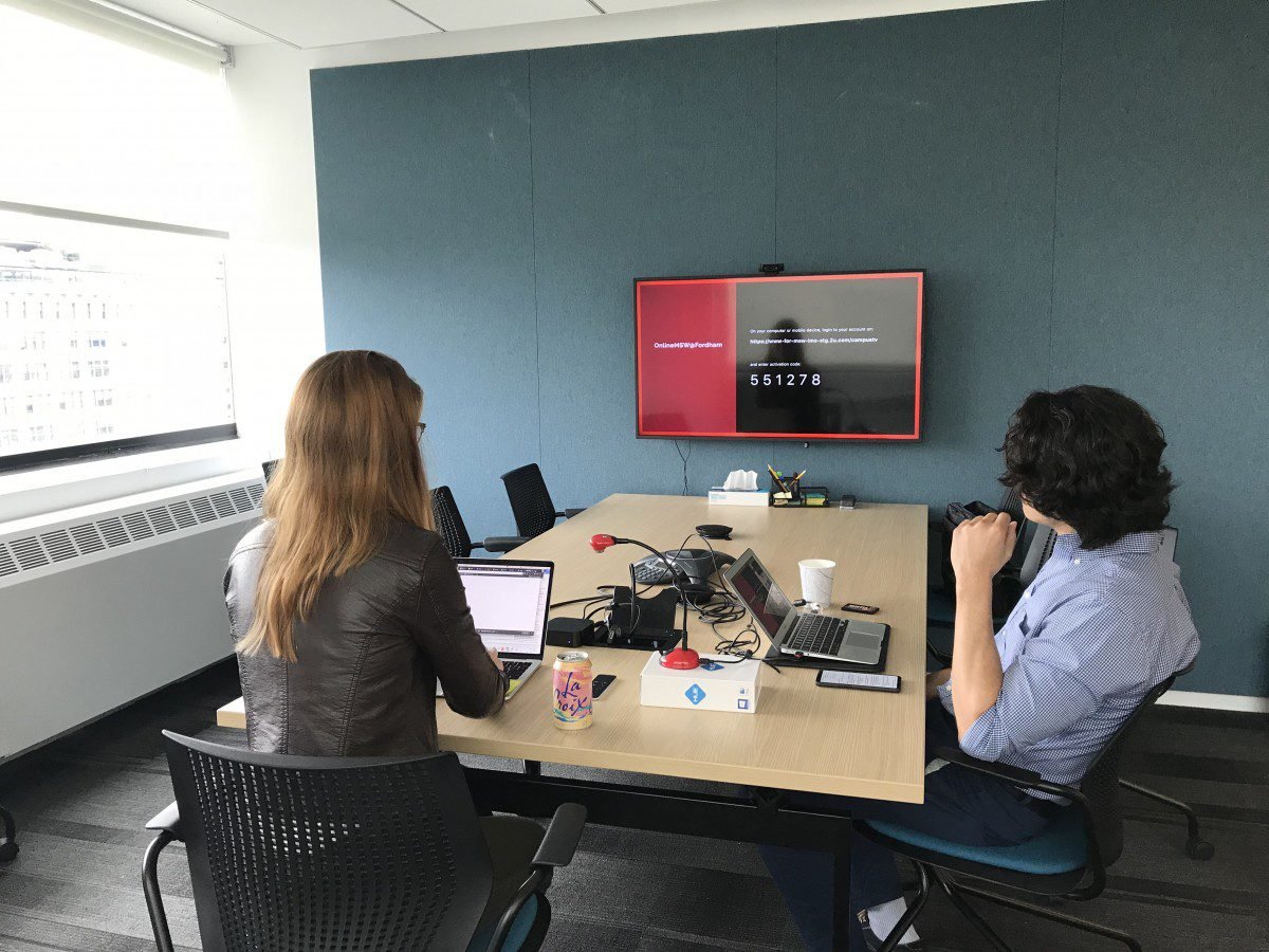
The set up for the this in-person moderated usability testing was using actual Apple TV that was mirrored and recorded on a laptop. To record the how the participants interact with the remote control, we used an external web cam that was connected to the same laptop, then we used Zoom to allow the team to observe the tests.
After each session, the core team got together to do an affinity map of our observation notes and identify action items accordingly. We opted to do it this way because there was no need for a usability test report. The outcome from the test was the list of usability issues and their associated action items.
Design and Usability Testing Round II
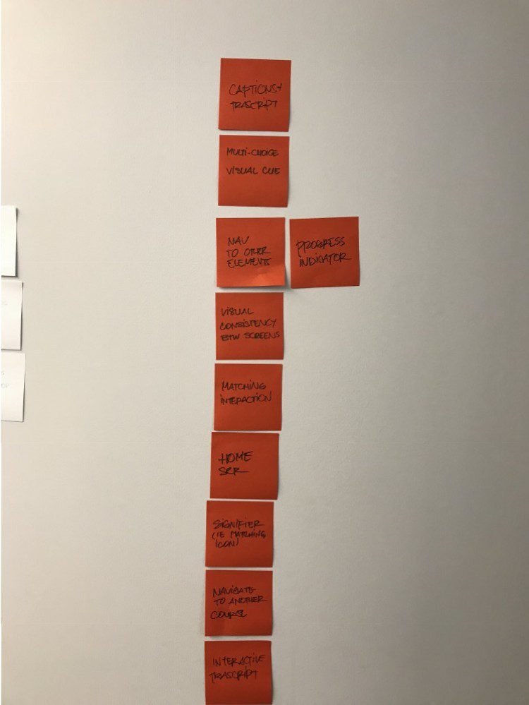
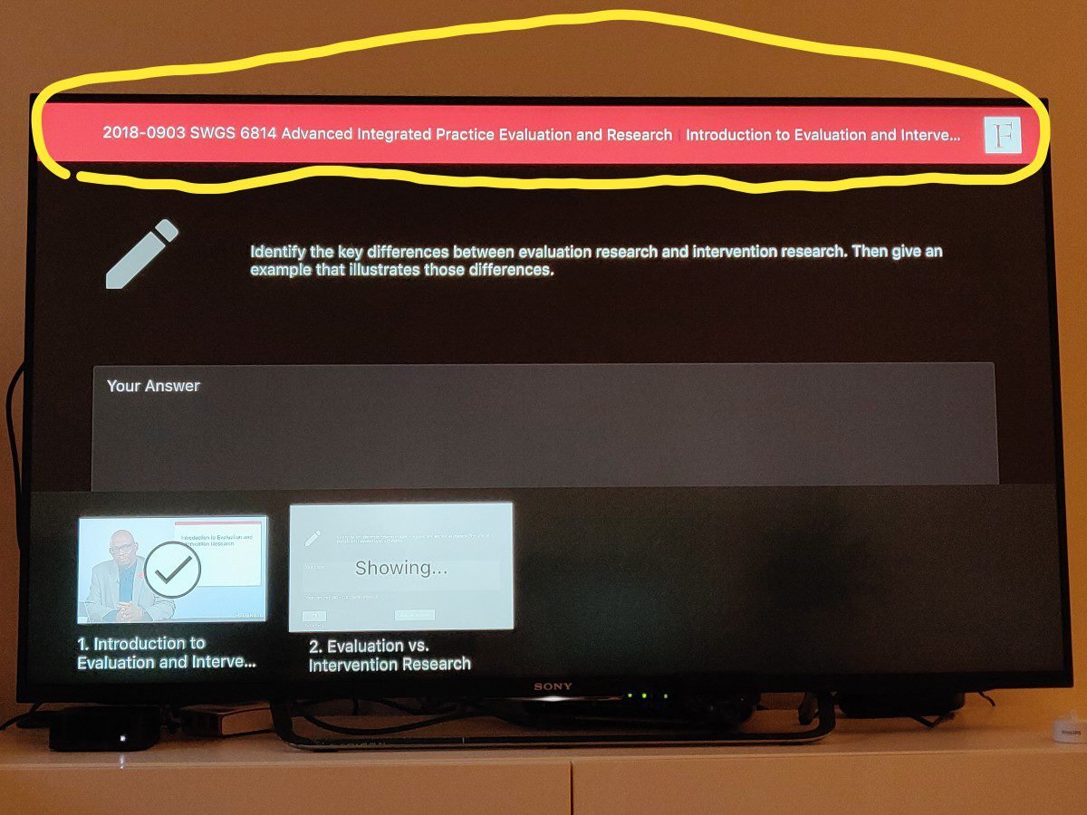
The focus for the second round was to address the usability issues we found in the previous round plus lateral navigation from one content topic to another, as well as common use cases like viewing PDF attachments.
This time, we tested with 5 participants using the same method as the previous round.
Design and Usability Testing Round III
For the last round, we addressed the issues found in the second round of usability testing and added things that we need to get this app ready for launch like edge case for navigation, playback speed control, home screen design and auto progression at the end of each content module.
For this last round, we also tested the prototype with 5 participants. Since we didn’t discover any major usability issues and the overall response was very positive, we felt confident to move to development.
Hand-off for Development, QA and Launch
For development hand-off, we delivered the visual specs and assets via Zeplin.
During the development process, our team was actively testing the many versions of staging builds and file tickets on JIRA for usability bugs and improvements to address use cases that we hadn’t accounted for in design phase.
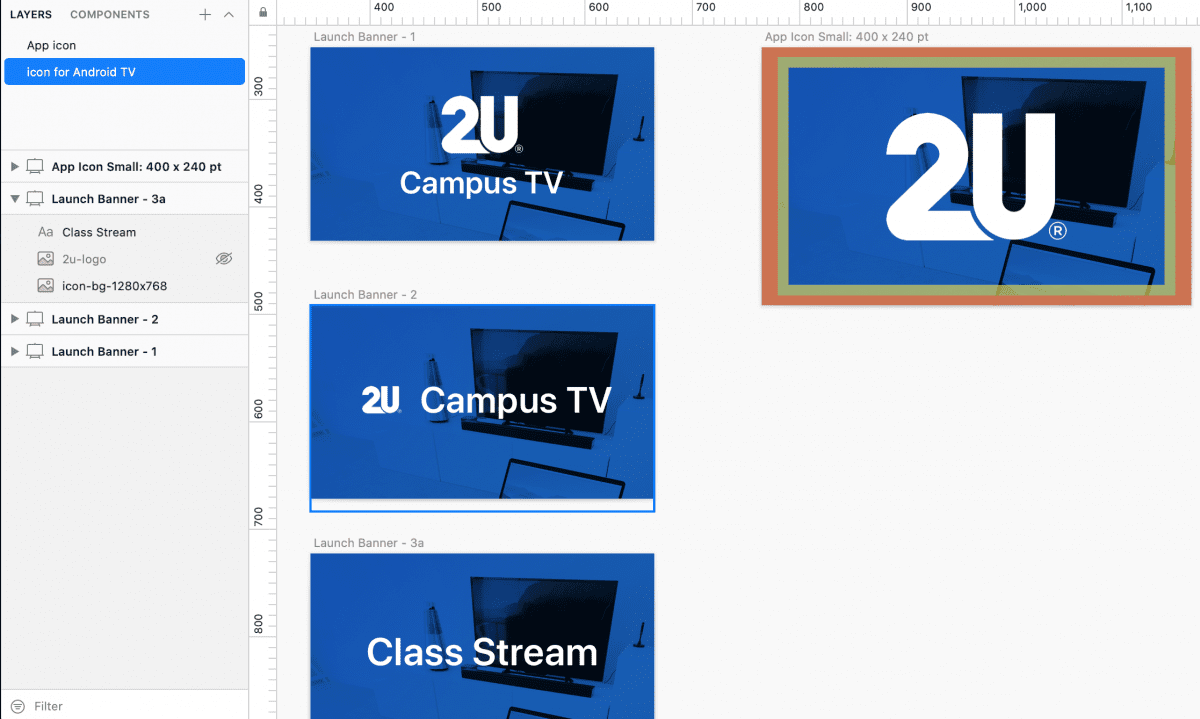
The last thing that we had to do once the app was ready was to provide assets for the launch: app store icon, splash screen and some documents for customer support training.
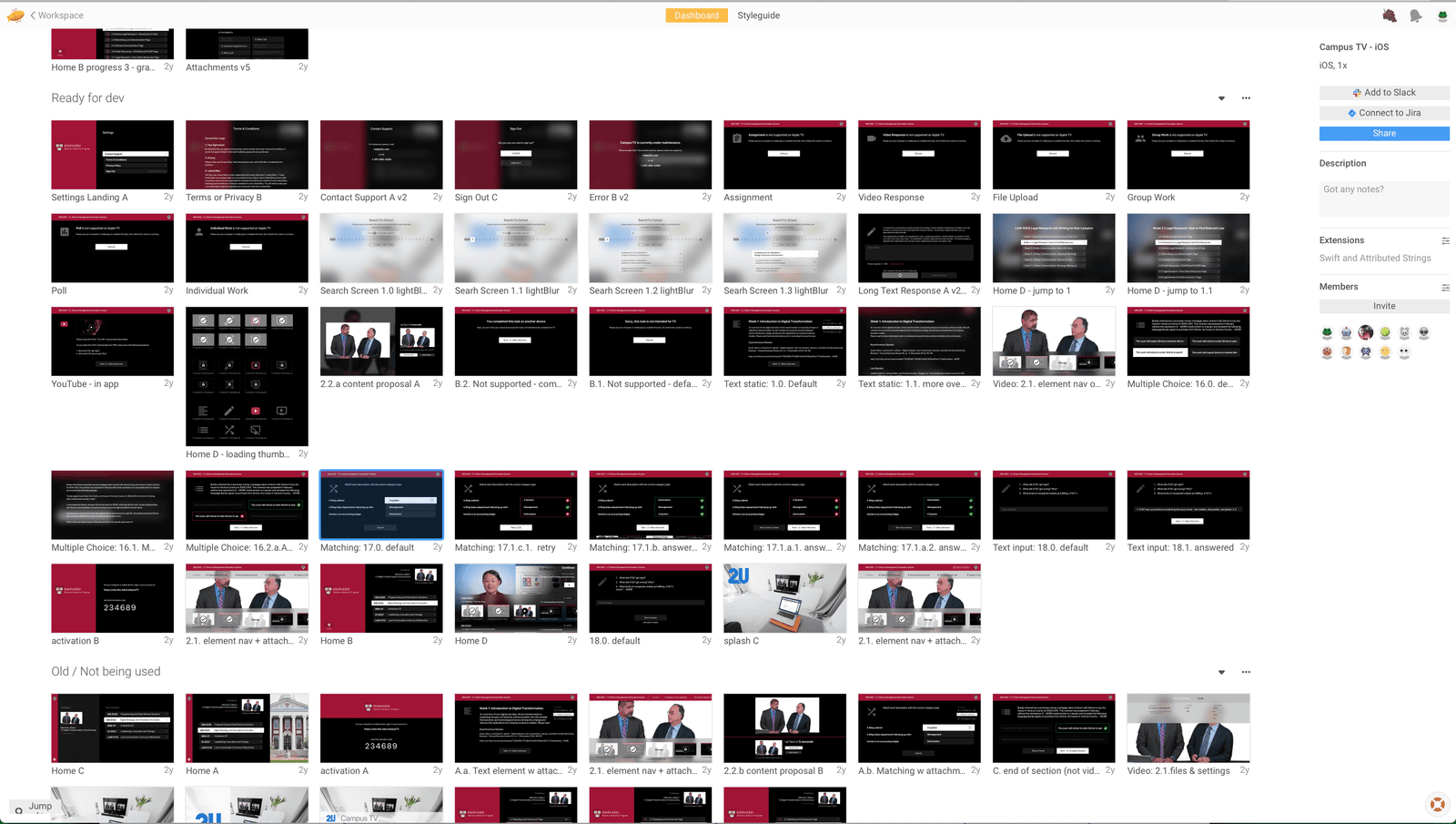
More Artifacts